There is a great difference between a good page and a perfect page. The two may be having the same content, with the difference in appeal that plays an important role.
Here, there are a few basics considered which have a deep impact on turning the page creative and attractive, with more traffic attracted to the web site:
Kerning:
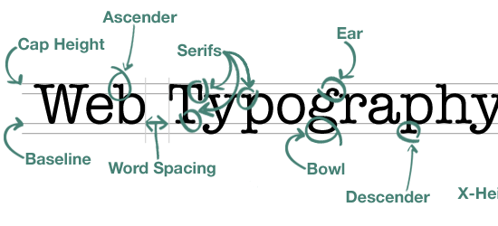
Kerning refers to the white spacing between the letters on the site. For different fonts, this spacing is different. However, less than a few millimeters difference in the spacing between two fonts can create a huge overall impact on the page readability and the design. Managing this space is very important, and the content can get completely ignored in void of a proper spacing. So, it may be a good idea to compare the viewer’s feedback with the same content typed in different fonts.
Forbid Comic Sans:
Out of all the fonts, Comic Sans is the most unprofessional. It is considered to be the least suited font of all when it comes to long texts. However, the initial appearance of the font wins the user’s attention when it comes to typing. It fails completely when it comes to the readability assessment. This font is too difficult and stressful for the eyes to grasp the content in a blink. In view of the fact that the viewers do not spend a lot of time reading the text as a whole, Comic Sans is not a preferred choice.
Structured Hierarchy:
The hierarchy of the page refers to many various features on the web page including the contrast, the font, the size, the spacing and the layout. A structured hierarchy deals with one or more of these features effectively used, so as to leave an overall impressive mark in terms of the page design. When concluding with the content, the hierarchy should be given some time to suit the best, sometimes complementing the content in itself. A good designer knows when to tweak the structure a little, and when to leave it untouched. However, without any arguments, this becomes a very important factor when it comes to the total view count on the page.
Fonts Usage:
Keeping the page simple makes it the most attractive. The usage of too many fonts not only refers to a worse design, it also sometimes makes the fonts incomprehensible. The reading is deeply devastated. By rule, a page should not be using more than 3 different fonts simultaneously. This helps in keeping the page neat and simple. The readability matters a lot. Any new viewer if finds it difficult to comprehend the text in a moment, is sure to leave the site.
Simplest For Long, Ornate For Short:
This may work like a magic. For the long text, the fonts used should be simple, however, for the headlines, quotes or short text, the use of ornate and stylish fonts give a catchy look to the page. This highlighting while maintaining the readability in parallel can be amazing.


