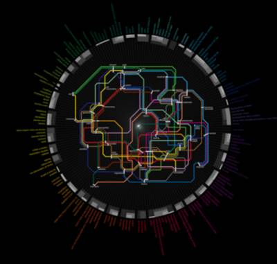
Now a days it has become extremely important for the companies to present the data in the more efficient and effective manner as most of all companies today are depending largely on the merge of the business intelligence and the big data which helps to make these organizations some cost effective decisions in favor of them. All these leads to the introduction of the data visualization services.

Data visualization is such an important tool that it helps in doing things that started from heat maps to infographics. It also helps in showcasing the most complex data or other important inferences in a simple visual format that can easily be understood by the viewers.
Understand the reader/user perspective:
While continuing with process of data visualization you should always remember the needs and the ability of the users or the viewers for whom you are doing this. Your entire effort will be futile if the viewers do not understand anything. You should always consider if they need to know any information prior to watch the final layout. The final design should be simple so that the viewers can easily chalk out the direction of the images in the design. The main target of the data visualization process should be to excite the readers instead of confusing them.
Lesser is better:
Always try to make your infographic simple using less data and design. It is quite impossible for a design to display each and every piece of data in a single infographgic or a single heat map. To accommodate and make your design simple you should select the most important data that are necessary to be displayed in the infographics and leave the others which are not that important. If after accommodating all the necessary data you find extra space then only you can insert the supporting data. But try not to overload the infographics with too much data. The data should be displayed in interesting and attractive manner so that the users show interest to your design. You should use appropriate fonts, sizes and colors and themes while designing the infographics.
Present it in the simplest way:
Your infographics should always be presented in the simplest manner so that everybody having different level of intellect can understand the data. Do not use too much graphics or the numbers which has too much decimal place if they are not necessary. Try to make it sober without disturbing the original data.
Mark a particular target:
While designing an infographic you should always try to attract the attention from the viewers. If there is any particular action area that should be targeted you need to highlight that. For example, if you are designing a heat map and showing any particular information such as area that is prone to crime or densely populated area then you need to mark that particular area in the map with colors. That marked spots will help the viewers to identify the densely populate area or the crime prone area in the map.
Make the design communicative:
If the designer intends to show the way one factor affecting another then he/she should make the design interactive by inviting the users to enter some necessary information. It is considered as one of the most powerful ways to make the campaign attractive and popular amongst the people.
Apply layers of data:
If you need to place huge amount of data in a single infographic, try to keep it layered. It will help the users to digest the information step by step. You can take the example of Google which presents basic information on particular subject but as soon as you start zooming in you can get more information about the same subject.
The data visualization services need a proper planning and execution and hard work from the designers to taste the success.


