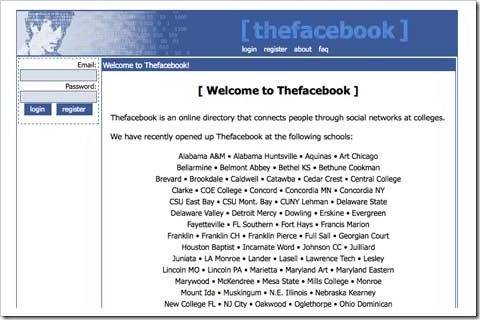
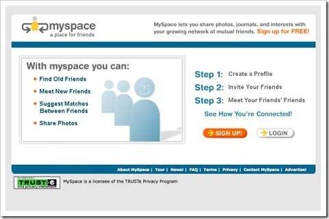
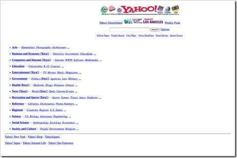
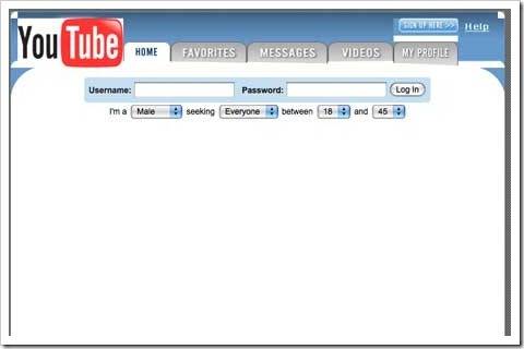
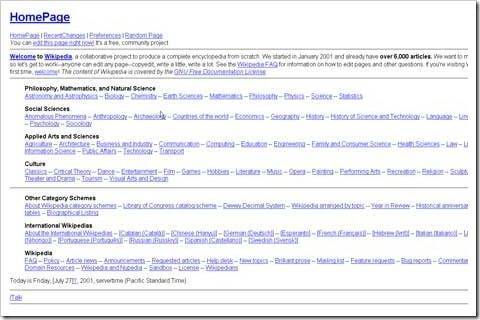
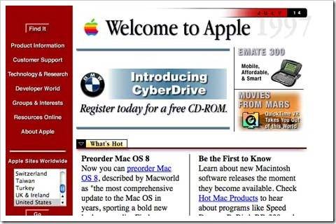
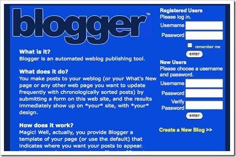
Have you ever wondered how sites such as Facebook, Google, Youtube, Wikipedia and Blogger looked, as it was first released? Below are pictures of some of the most popular web sites, while they were still in their early versions. With regard to your project today, they have definitely evolved a lot and will continue. Google recently launched a reform to all their products and services, an attempt to unify their products and services.



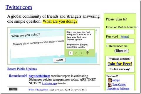


Strangely Twitter looks one of the most dated but was released more recently than most of the others.
Yes! Launching in 2006, Twitter became a fastest Growing social network.
Hi Isha,
You have got a nice topic to write on. Great post dear!!! It is really funny to look at these sites. 🙂
Thanks you liked it!
Oh, it is really interesting to look at them, they have really changed! ii have never wondered how they had looked before, but it is a good idea to show them here.
At initial stage all site design were funny as compared to present design. They changed lot and still in proceess.
This is really interesting and wonderful, you have found these snap shots with wayback machine han. Amazing to see that these web brand improved their selves a lot.
No, not exactly with wayback machine. Yes, they improved and seems to improve more in future.
I think its really interesting to look at the google image in particular. I saw a video featuring on of the first few google employees. She said that when they were doing user tests, individuals would sit in front of the google screen and not do anything. When they were asked why they were not using the site they would say things like “I am waiting for the rest of the page to load.” The confusion arose because at the time google was a very sparse page with a lot of white space in comparison to other pages of its time. Users really were not used to seeing pages like this. It probably didn’t help that the internet was much slower :).
What’s interesting is that as I look at the google page now. It is much more cluttered than its current version. By today’s standards it is not really that empty.
Also, these examples really show how far we have come with web design because most of these pages are pretty unattractive!
As with time, technology also improved with lead to attractive designs today! thanks for your comment.
Great post, reminds me on old times.Old Facebook was far better than this new timeline crap and on old facebook I had more privacy 🙁
Agree with you. The old look was far better than the new timeline.
Thank you for this post. It´s funny and interesting to see how websites change.
At the beginning every admin is happy when a website just works. After that you have to improve it and change the design.
I knew the (old) Facebook site design just from watching the movie “the social network”.
Yes, when the website become famous and on the way to success their is always need to improve and care. Btw didn’t see “The Social Network” movie, hope to see it in holidays!
They all look pretty terrible haha, although to be fair not much has changed with Google 🙂
Yup, they have a simple interface which the best.
google and facebook looks pretty funny lol.. It shows that those geeks started from basic only and are people like us.. (motivating one)