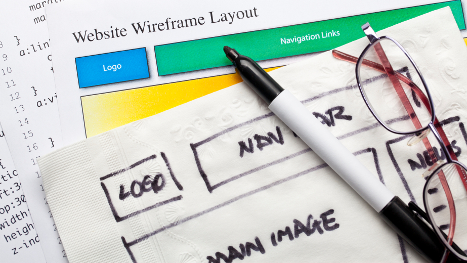
In 2013 we can expect web designers to be stepping up. Design trends seem to point toward usability as the number one priority, as it always should have been.

If your page is guilty of any of the following, you may have some redesigning to consider.
Extravagant Fonts
Whether it is too extravagant or too unconventional, designers need to be wary of their font choices. An obtrusive font choice can no longer stand on its own as a unique design element. The art of typography is more important than it ever has been. Expect designers to be using text creatively via altering its size, position, and style. It should be readable above all else. Clever usage of typography can allow for a navigation system that is fresh, but still familiar.
Overuse of Visual Effects
Intense drop shadows and bevels on fonts are no longer in style. They are being revealed for what they are – excessive. This is especially true for design elements such as buttons. As we put the Web 2.0 age behind us, glossy buttons are an artifact. Buttons should be functional but still attractive. Photoshop-based web design is starting to fall out of favor. The power of HTML5 combined with CSS3 is potent. CSS3 can create borders, shadows, animations, and more. By relying solely on this combination you can expect your pages to be small-sized and multi-platform compatible.
Flash
HTML5 and CSS3 are replacing Flash. Flash web pages have loading times and are designed with the assumption that the user has Flash. With Adobe recently dropping Flash update support for Android phones, you will be alienating a large part of the mobile user base. While Adobe Flash’s fate is not yet certain, you can accomplish just as much without it.
Busy Pages
Aesthetics for the sake of aesthetics is no longer a viable way to design a page. Visual creativity is still possible without incorporating unnecessary elements. Whether it is ornate frames, flashy images, or clichéd stock photography, think twice about your choice of visual embellishment. That is not to say your site should be a purely minimalist affair. If you have a particular aesthetic in mind, carefully chosen visual elements can help give your page a sense of individuality and intrigue users.
Unbridled Skeuomorphism
Skeuomorphism is simply the word used when a page is made to look like a real tactile object. While it may have seemed cutting edge to make your page look like a desk in 2007, it is just overly superficial now. This trend has lost the majority of its power from overuse more than anything else. If you can think of a new way to go about the idea, it may still be of some use.
Along with usability, minimalism is the largest web design trend of 2013. That is not to say your page should be empty, but use of white space, multi-platform usability, and streamlined design will help create a modern aesthetic. By forgoing gimmicky design, it forces the designer to work with the essentials. The foundational principals of good design are never going to be outdated.


